Top 10 Essential Elements to Create a Professional Logo Design

A professional logo design can help you make that all-important first impression on a customer.
A logo speaks your company’s principles, tells a story, and even aids in brand trust.
Your company will be at a disadvantage right away if your logo does not send the proper message to a potential customer. It might possibly mean the difference between the competition and you being chosen.
To address this demand, LogoDigitals has designed a feature-rich design suite dedicated to developing your logo and brand. To assist you in creating an original and effective image, you can utilize our logo builder and branding toolkit. It exemplifies the right aspects of your brand while creating the best custom logo design.
10 Features By The Best Logo Design Agency for Professional Logo Design

1. Powerful and Well-Balanced.
A logotype is a visual representation of something, whether simply words, just a graphic symbol, or both. It should be a reflection of your firm’s heart and soul, as well as its individuality.
Because you want your brand logo design to reflect your business, keep your target demographic and products/services in mind. Solid and well-balanced logo designs are the most beneficial in this modern digital era.
2. Simplicity is the Key
The importance of simplicity is the key to improve and create a unique logo design. Simplicity reduces the confusion in the minds of the people while it remains on top of mind recall.
A complicated logo will be tough to print and reproduce, and your audience may not be totally engaged.
Consider some of the most successful and/or well-known brands. Companies like Apple, Volkswagen, Target, McDonald’s, and others are likely to come to mind.
What is the one thing they all have in common? When printed on their own or in full black and white, they all have basic and immediately recognizable professional logo designs.
3. Memorability Is Vital
It is not always necessary for your logo to describe what your company does. Have you ever seen a car manufacturer’s logo that is an image of an automobile?
What about a shoe company? A shoe on a shoe picture would be ridiculous.
Consider icons that might communicate your brand without utilizing the company name while designing your professional logo design. (For example, Nike’s Swoosh) As a result, you’ll be able to utilize the icon as a standalone image (on product packaging, for example).

When an icon is overtly evident or simple to “read,” the viewer frequently lacks a sense of discovery or personal ownership of it. However, keep in mind that too much abstraction can lead distract viewers about your message.
4. Scalable and Legible
A quality logo design must be scalable and legible so that customers remember it when they study it, even when it is small.
A logo should be visible and distinct from a distance of 100 meters or 20 millimeters on a large billboard or a little business card.
It should also perform well in a variety of sizes, such as business cards, brochures, t-shirt designs, and other marketing materials like embroidery, stamping, and embossing.
A good logo will work in a variety of hues as well as just one or two (yes, black is a color).
A good logo will look nice on both light and dark backgrounds, as well as multicolored ones.
Make sure you use your company logo design consistently and that it gives you the ability to do so in various ways. Our guide to adaptable logos can help you learn more about them.
5. Use the Right Color Combinations
Do the colors help to reinforce and strengthen the main message/personality/mood you’re attempting to convey through the logo, or do they distract or neutralize it?
Consider the message that color speaks to your customers if you’re looking for a color logo for your company.
Blue, for example, is frequently used to convey trust, devotion, and freshness. Blue is a popular hue in banking and finance.
The green color is associated with life, nature, and cleanliness.

Background colors that are dark and white are effective. Because logo designs are usually printed in black & white, use a professional logo design that is equally effective in both colors.
Consider possible future uses of the professional logo design, such as letterheads, business cards, and products, even though gradients create an aesthetically pleasing look on PCs. Will the logo be simple to print and reproduce in and on a variety of media?
Consider using no more than three colors in your professional logo design; using too many colors will increase printing costs and make the design more difficult to replicate.
Despite the fact that such prices have fallen significantly, this is still sound advice.
6. Timeless Logo Design
A custom logo design must remain timeless. Trends are useful, but innovation is even more so. (And fads are frequently fatal.)
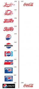
A professional logo design should have a long shelf life. It may develop and evolve through time, but the longer it remains true to its core, the more brand recognition you will gain. Coca-Cola, Dior, and Rolex are just a few examples.

An excellent logo will have a timeless quality. A professional logo design that feels like it belongs to a specific era is more likely to feel old or require significant rebranding pretty fast.
The best logos don’t change much, but they always feel fresh and lively.
Why LogoDigitals?
As a logo design company, LogoDigitals gives professional logo designers that have unique ways of saving time and effort while brainstorming ideas for a new company logo design. You must first enter your brand name and other branding characteristics to gain access to the thousands of example logo concepts accessible only in our space. Our projects are all original and creative that 100% satisfy the customers.
It’s as simple as that! As you can see, having a custom logo design is critical for a successful business and brand. Are you willing to invest in a tailored logo design to help your business grow?


